
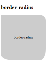
<h2>border-radius</h2>
<div id="sample1" style="width:200px; height:200px; background:rgba(204,204,204,1); text-align:center;">
<p style="padding: 45% 0;">border-radius</p></div>
#sample1 {
  -moz-border-radius: 0 25px 25px 50px/ 0 25px 50px 25px;
  -webkit-border-radius: 0 25px 25px 50px/ 0 25px 50px 25px;
  border-radius: 0 25px 25px 50px/ 0 25px 50px 25px;
  /* 左上・右上・右下・左下の順で水平方向の半径セットと
    垂直方向の半径のセットをスラッシュで区切る */
  /* 値4つ=左上、右上、右下、左下(時計回り) */
  /* 値1つ=4コーナー全部 */
}
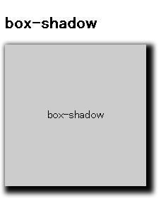
<h2>box-shadow</h2>
<div id="sample2" style="width:200px; height:200px; background:rgba(204,204,204,1); text-align:center;">
<p style="padding: 45% 0;">box-shadow</p></div>
div#sample2 {
  box-shadow: 5px 5px 10px 5px #000;
  -moz-box-shadow: 5px 5px 10px 5px #000;
  -webkit-box-shadow: 5px 5px 10px 5px #000;
  /* 水平方向、水平方向、垂直方向、ぼかし距離、広がり距離、色 */
}
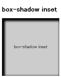
<h2>box-shadow inset</h2>
<div id="sample2b" style="width:200px; height:200px; background:rgba(204,204,204,1); text-align:center;">
<p style="padding: 45% 0;">box-shadow inset</p></div>
div#sample2b {
  box-shadow: 5px 5px 10px 5px #000 inset;
  -moz-box-shadow: 5px 5px 10px 5px #000 inset;
  -webkit-box-shadow: 5px 5px 10px 5px #000 inset;
  /* 水平方向、水平方向、垂直方向、ぼかし距離、広がり距離、色 */
}
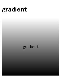
<h2>gradient</h2>
<div id="sample3" style="width:200px; height:200px; text-align:center;">
<p style="padding: 45% 0;">gradient</p></div>
div#sample3 {
  background-image: -moz-linear-gradient( /* Firefoxの場合 */
    top, #fff, #c00
  );
  background-image: -webkit-gradient( /* Webkit系の場合 */
    linear,
    left top,
    left bottom,
    color-stop(0%, #fff),
    color-stop(100%, #000000)
  );
  background: linear-gradient( /* 標準のCSS */
    top, #fff, #000000
  );
}

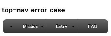
<div id="top-nav">
<h2>top-nav error case1</h2>
    <ul>
      <li><a>Mission</a></li>
      <li><a>Entry</a></li>
      <li><a>FAQ</a></li>
    </ul>
  </div>
 ul, li {
  margin: 0;
  padding: 0;                                                   /* A */
  fornt-family: sans-serif;
}
#top-nav ul {
  border-radius: 12px;
  background-color: #000000;
  background: -webkit-gradient(linear, left top, left bottom, from(#666666), to(#333333));
  font-size: 14px;
  width: 300px;
  margin: 0 auto 20px auto;
}
#top-nav ul li {
  list-style-type: none;                                /* B */
  text-align: center;
  float: left;
  font-weight: bold;
  border-right: 1px solid #000000;
  padding: 8px 0;
}
#top-nav ul li:last-child {
  border-right: none;
}
#top-nav ul li a {
  display: block;
  width: 99px;
  padding: 8px 0;
  color: #ffffff;
  text-decoration: none;
  text-shadow: -1px -1px 0 #000000;
}
#top-nav ul li:last-child a {
  width: 100px;
}
#top-nav ul::after {
  content: "";
  display: block;
  clear: both;
}

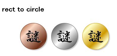
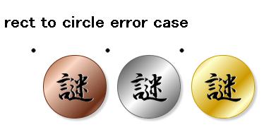
<h2>rect to circle</h2>
  <div id="mission">
    <ul>
      <li><a><img src="rect2circle.png" alt="銅の謎" /></a></li>
      <li><a><img src="rect2circle.png" alt="銀の謎" /></a></li>
      <li><a><img src="rect2circle.png" alt="金の謎" /></a></li>
    </ul>
  </div>
#mission {
  display: block;
  margine: 0;
  padding: 0;
  font-family: sans-serif;
}
#mission ul {
  width: 300px;
  margin: 0 auto 20px auto;
}
#mission ul li {
  float: left;
  list-style-type: none;                                /* A */
}
#mission ul::after {
  content: "";
  display: block;
  clear: both;
}
#mission ul li:first-child,
#mission ul li:nth-child(2) {
  margin-right: 15px;
}
#mission ul li a img {
  display: block;
  width: 88px;
  height: 88px;
  border-radius: 44px;
  -webkit-box-shadow: 3px 3px 3px #cccccc;
  box-shadow: 3px 3px 3px #cccccc;
}
#mission ul li:first-child img {
  border: 1px solid #6c2e16;
  background: #ff9900;
  background: -webkit-gradient(linear, left top, right bottom, from(#97461a), color-stop(0.3, #fbd8c5), color-stop(0.8, #6c2e16), to(#efdbcd));
}
#mission ul li:nth-child(2) img {

  border: 1px solid #666666;
  background: #ff9900;
  background: -webkit-gradient(linear, left top, right bottom, from(#333333), color-stop(0.5, #ffffff),to(#333333));
}
#mission ul li:last-child img {
  border: 1px solid #cc9900;
  background: #ff9900;
  background: -webkit-gradient(linear, left top, right bottom, from(#cc9900), color-stop(0.2, #ffffcc), color-stop(0.6, #cc9900), color-stop(0.8, #ffffcc), to(#cc9900));
}
<h2>gradient</h2>
<div id="sample3" style="width:200px; height:200px; text-align:center;">
<p style="padding: 45% 0;">gradient</p></div>
div#sample3 {
  background-image: -moz-linear-gradient( /* Firefoxの場合 */
    top, #fff, #c00
  );
  background-image: -webkit-gradient( /* Webkit系の場合 */
    linear,
    left top,
    left bottom,
    color-stop(0%, #fff),
    color-stop(100%, #000000)
  );
  background: linear-gradient( /* 標準のCSS */
    top, #fff, #000000
  );
}